Mobile App
The Expert App
Services
UX Research
UX Design
UI Design

About the Project
The Expert App connects amateurs with experts across various fields, offering users the ability to get personalized advice tailored to their specific needs. As the app’s creator, I initially designed the user experience and interface from the ground up, guided by user research. After gaining more experience as a designer, I revisited the app to focus on refining the visual aesthetics, correcting rookie mistakes, and enhancing the UI for a more polished, professional feel.
The Challenge
The Expert App was designed to allow amateurs to connect with experts in real time, enabling users to ask specific questions and receive expert advice with personalized context.
However, after the original launch, I recognized the need for a more refined aesthetic and user interface as my design skills evolved. While the core functionality of the app remained effective, the visual design needed an update to align with modern design standards and improve usability.
Original Design:
User Research, UX Design, and UI Design
The goal of the original design was to create an app that simplified expert consultations, allowing users to connect with professionals in a streamlined way. I was responsible for the UX research, UX design, and UI design, with the aim of making the app both intuitive and effective for users.
Research and Discovery
In the initial phase, I conducted comprehensive user research to understand the target audience and their needs:
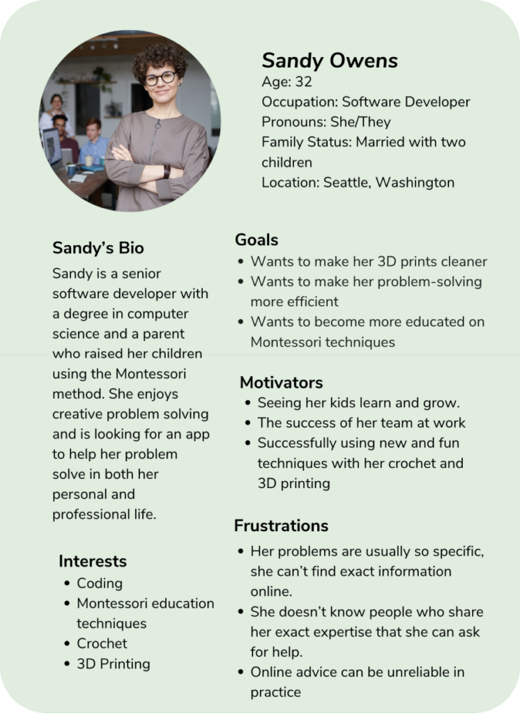
- User Personas: I developed detailed personas to define user goals, behaviors, and frustrations. For example, users valued receiving advice that was specific to their situation but found it challenging to navigate platforms cluttered with general information.
- Key Insights: Users desired an app that allowed them to connect with experts easily, without complicated steps or a cluttered interface. This insight shaped the foundation of the user flows and overall design.
UX Design
The original UX design focused on creating simple user flows to help users easily connect with the right expert.
- User Flows: I mapped out the pathways for users to search for experts, book consultations, and engage in conversations, ensuring that each interaction was smooth and logical.
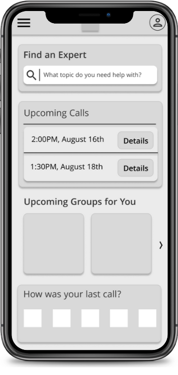
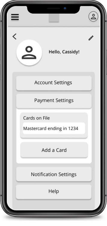
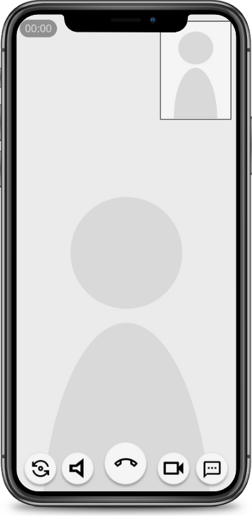
- Wireframes: Based on the research and flows, I created low-fidelity wireframes to outline key screens and interactions.
UI Design
With the user flows and wireframes in place, I developed the original user interface:
- Initial UI: The focus was on simplicity, with clear navigation and easy-to-read layouts to help users quickly find the information they needed.
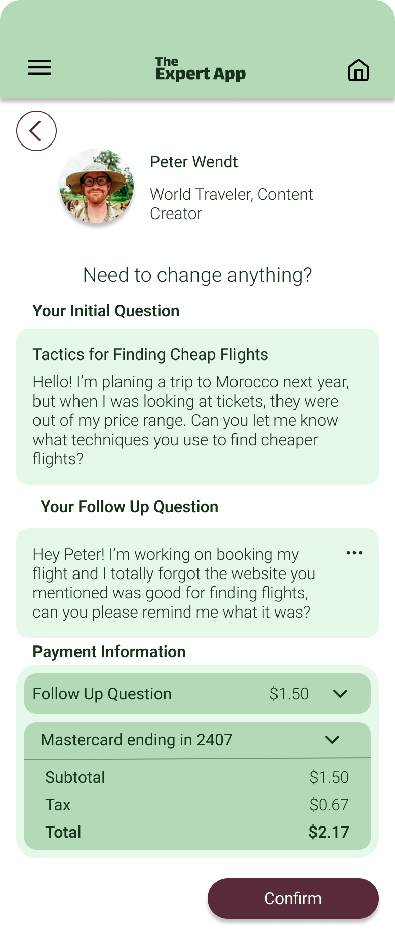
- Visual Style: I used a basic, approachable design style that aligned with the app’s functional focus, but in hindsight, lacked the polished aesthetic needed for a professional feel.
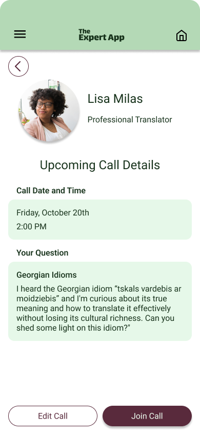

Updated Design:
UI Redesign
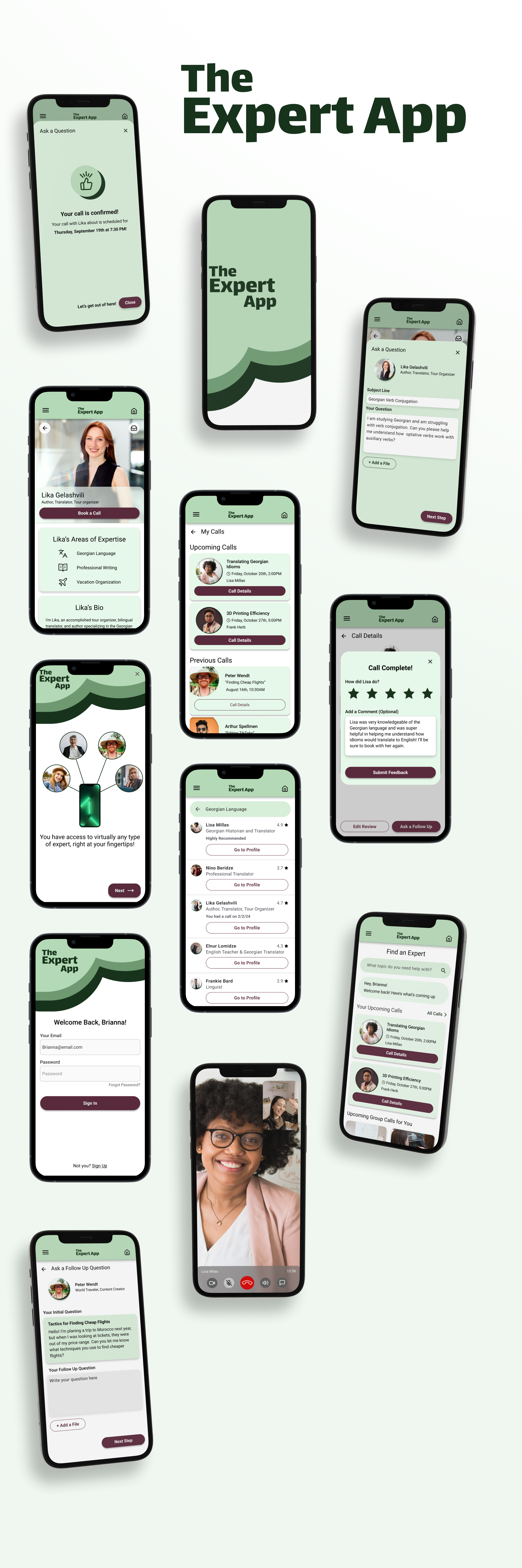
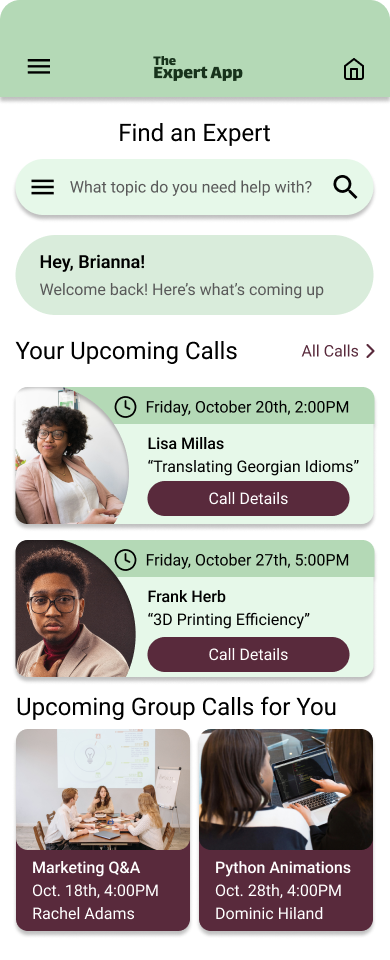
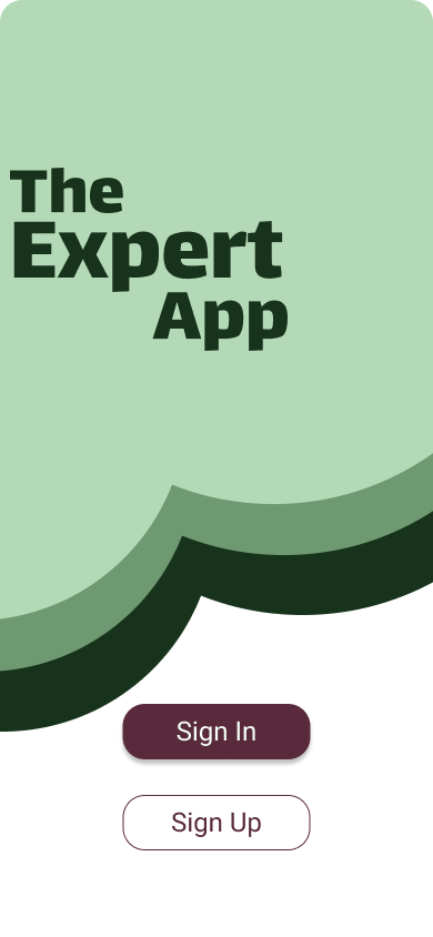
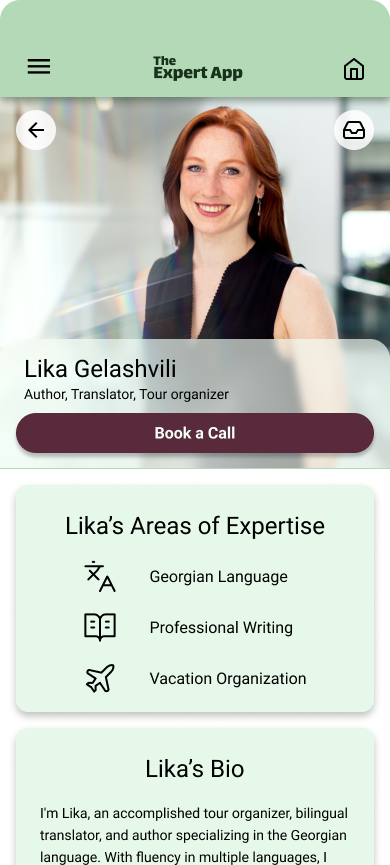
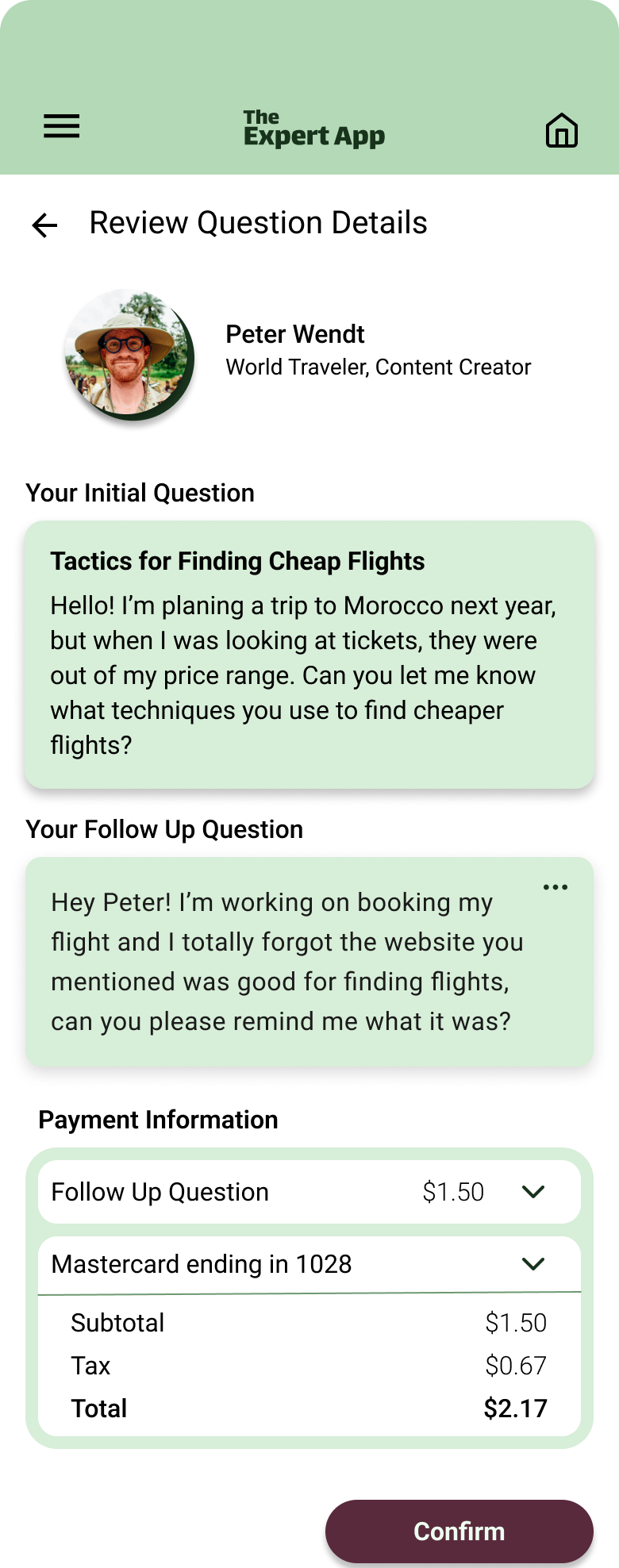
After growing as a UX/UI designer, I saw the opportunity to revisit The Expert App and refine the user interface to create a more cohesive, polished, and professional design. The focus of the redesign was to fix past design mistakes, establish a clear visual hierarchy, and enhance the overall user experience.
Key Focus Areas
Establishing Visual Hierarchy
- Clear Pathways: One of the primary goals was to create a stronger visual hierarchy to guide users naturally through the app. I reworked the layouts to emphasize key actions—such as booking an expert or asking a question—so users could immediately understand the next steps without confusion.
- Text and Button Prioritization: I refined the typography and button styles, making sure that the most important actions were easy to find. Headlines and call-to-action buttons were given more prominence, while less important information was scaled back to avoid overwhelming the user.
- Organizing Content: By organizing content based on user needs and expectations, I ensured that users could quickly and easily access the information or functions they were looking for.
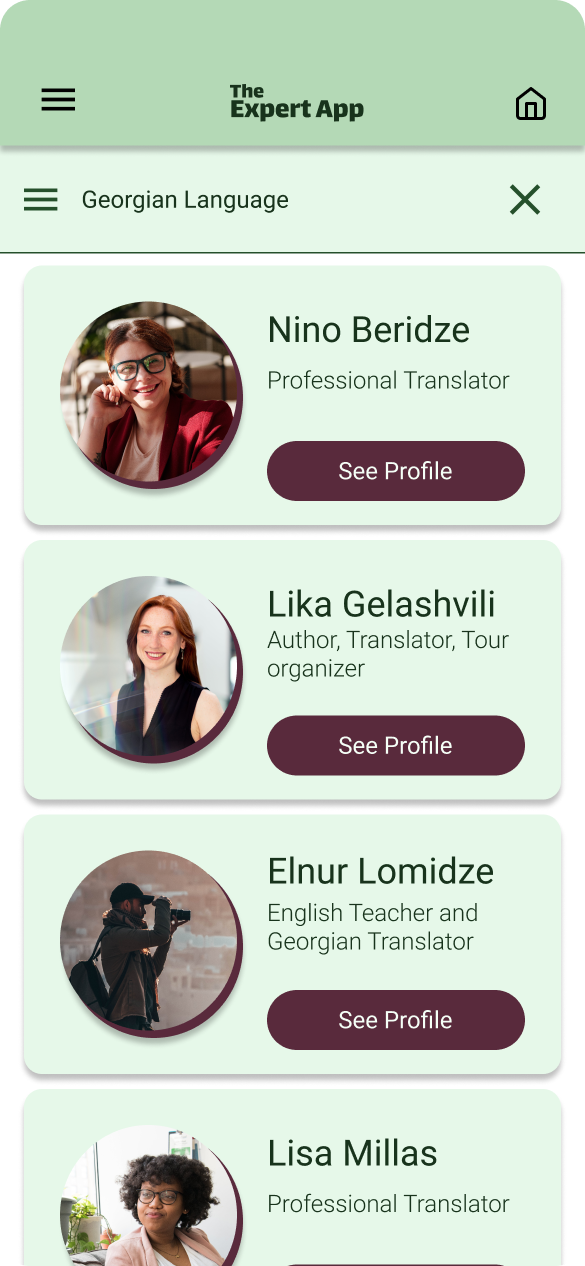
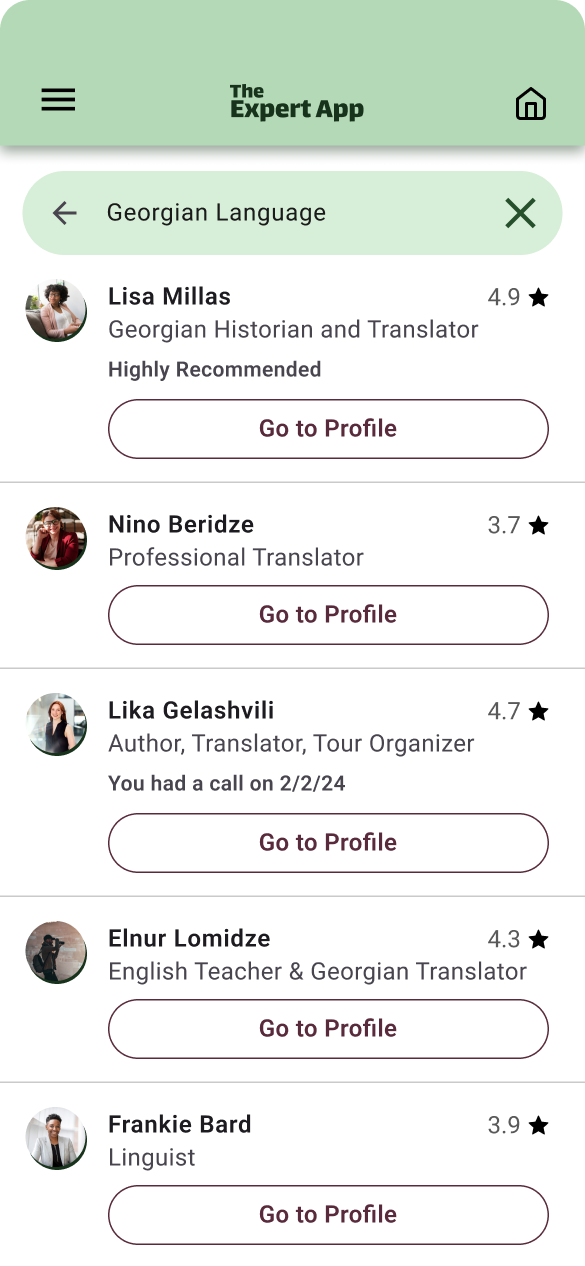
Polishing Design Elements
- Refining Spacing and Alignment: In the original design, there were issues with inconsistent padding and uneven alignment. During the redesign, I paid close attention to spacing, ensuring that every element was well-aligned and that the app had a cleaner, more professional appearance.
- Smoothing Out Rough Edges: Many visual elements in the original design felt disconnected or inconsistent. I focused on unifying the design, ensuring consistent use of colors, fonts, and iconography throughout the app.
- Improving Consistency: I standardized design elements, such as buttons, navigation bars, and card layouts, to provide a consistent look and feel across all screens. This not only improved aesthetics but also contributed to a more intuitive experience for the user.
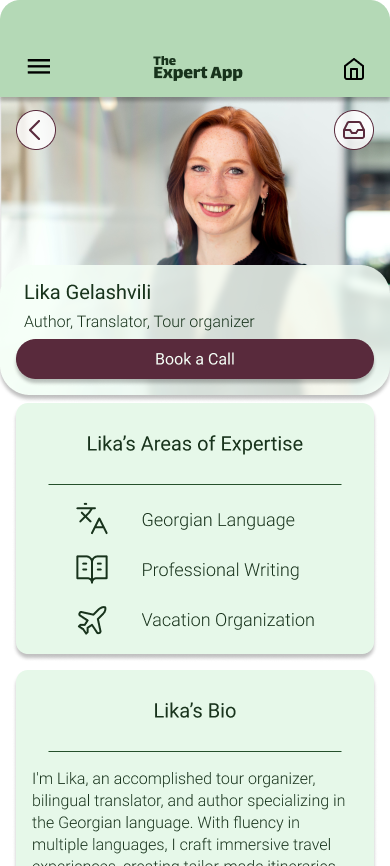
Enhancing the User Experience
- Simplifying User Interactions: The improved visual hierarchy and cleaner design made the app easier to navigate, reducing cognitive load and allowing users to focus on the tasks that matter—finding and connecting with experts.
- Reducing Friction: By polishing the UI and ensuring a seamless flow between screens, I minimized friction points, making it easier for users to complete actions like booking consultations or exploring expert profiles without getting lost or confused.
- Intuitive Design: Every design decision aimed to create a more intuitive experience, from better button placement to more readable text, ensuring that users could easily understand and interact with the app.
Challenges
The biggest challenge during the redesign was revisiting my own earlier work and identifying where I had made rookie mistakes. While the original design was functional, it lacked polish and consistency. As my design skills grew, I recognized areas where the initial UI suffered from visual clutter, inconsistent layouts, and ineffective hierarchy.
Key challenges included:
- Correcting Past Mistakes: Many design elements were misaligned or unevenly spaced, which contributed to a disjointed and amateur appearance. I needed to clean up these inconsistencies to make the interface feel cohesive.
- Establishing a Clear Visual Hierarchy: The original design didn’t prioritize important user actions like booking or contacting an expert, leading to confusion and missed opportunities. I had to restructure the UI to guide users intuitively through the app.
- Balancing Functionality with Aesthetic: While the functionality remained solid, my challenge was making sure that the visual improvements complemented and enhanced the app’s usability without overwhelming users.
These challenges pushed me to rethink and improve every aspect of the app’s UI, ensuring that both design and user experience were aligned.
The Results
The redesigned Expert App now provides a clean, professional, and highly intuitive user experience. By focusing on improving the visual hierarchy, polishing the design, and addressing earlier mistakes, I was able to deliver an interface that better serves the app’s purpose of connecting users with experts.
Key Outcomes:
- Clear Visual Hierarchy: Users can now easily navigate the app, with important actions like expert booking and profile browsing clearly highlighted. The improved hierarchy helps guide users through the app without confusion.
- Polished Aesthetic: The app now has a cohesive, modern look, with consistent use of color, typography, and spacing across all screens. The visual improvements make the app feel more professional and inviting.
- Enhanced User Experience: With cleaner design elements, more intuitive navigation, and reduced visual clutter, users are able to interact with the app more effortlessly. The streamlined interface makes it easier for users to accomplish key tasks, improving overall engagement and satisfaction.
- Personal Growth: This project served as a significant milestone in my development as a designer. By confronting and correcting earlier mistakes, I was able to create a more refined and polished product that reflects my growth in UX/UI design.
