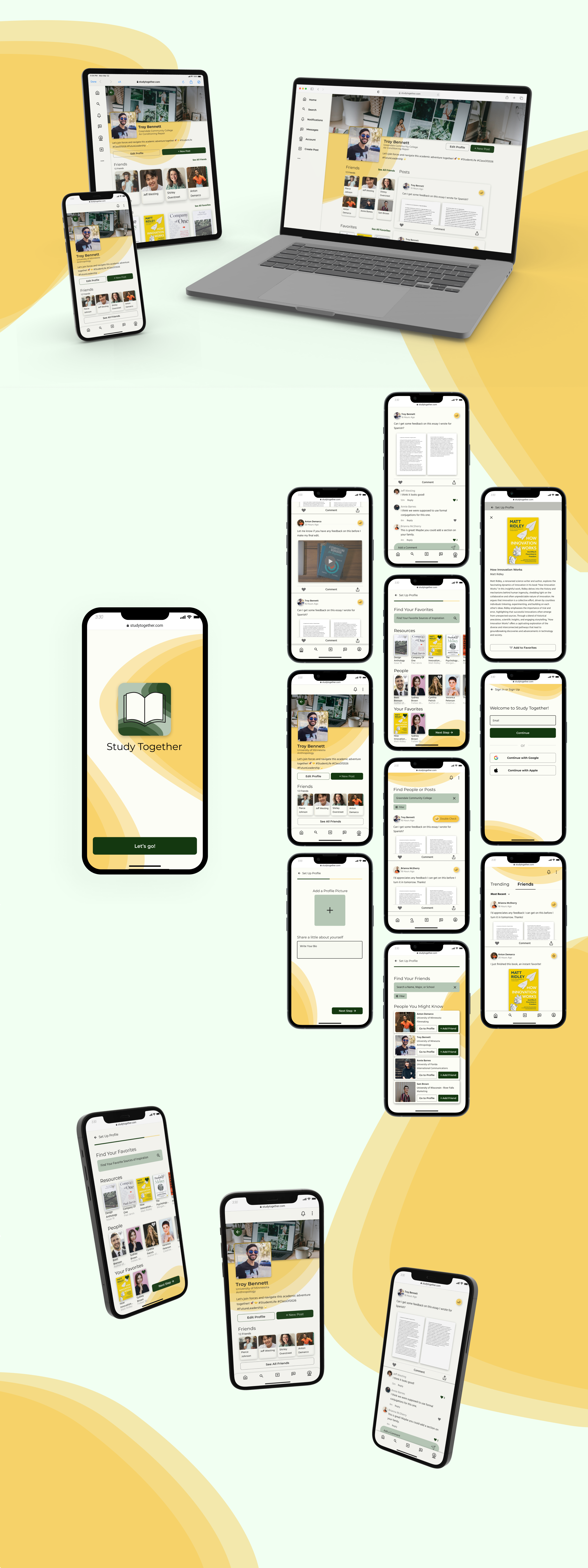
Responsive Website
Study Together
Services
UX Design
UI Design


About the Project
Study Together is an original app designed to help students connect, share study materials, and receive feedback on their work. Tailored for students who may not be able to attend campus or who lead busy lives, the app fosters a collaborative learning environment through a user-friendly, accessible interface. This case study outlines the creative process behind the app, highlighting its mission to enhance student collaboration and academic success.
The Challenge
The challenge was to create an app that supports students who cannot easily access on-campus resources or are managing busy schedules. These students needed a platform where they could connect with their peers, share study materials, and receive feedback—without the limitations of in-person study groups or campus visits. The app had to be intuitive, creative, and supportive of a variety of learning needs.
The Solution
The solution was to develop an app that enables remote collaboration, allowing students to easily share study materials and receive feedback from their peers. The app’s features emphasize simplicity and connectivity, making it easy for students to build meaningful academic relationships, regardless of physical location.
Key Features:
- Peer-to-Peer Connection: The app provides tools for students to connect with one another and build a collaborative learning community.
- Study Material Sharing: Users can upload and share notes, study guides, and other educational resources to support one another’s academic progress.
- Feedback Mechanism: Students can give and receive feedback on shared materials, promoting active participation and deeper learning.
The Process
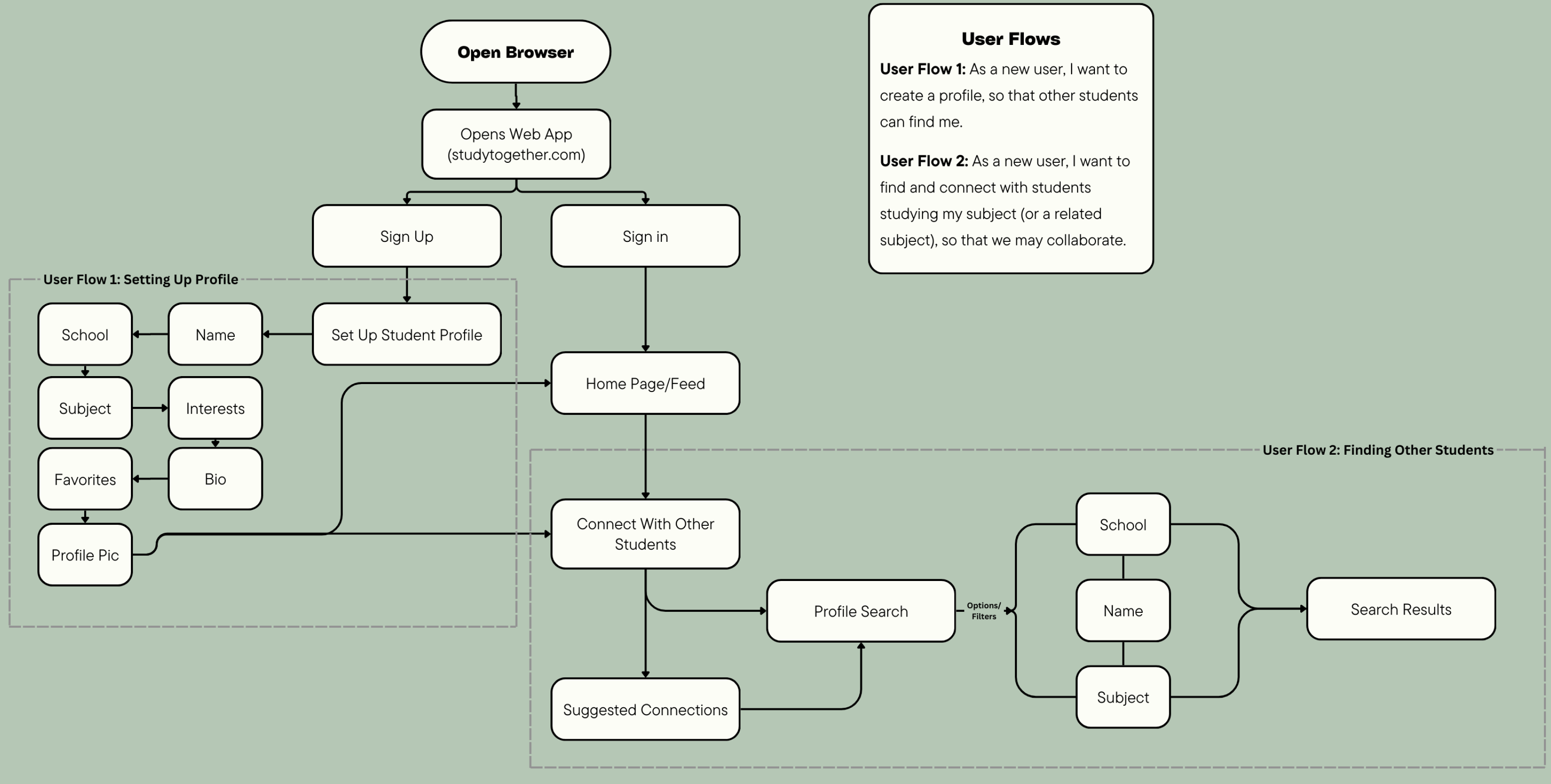
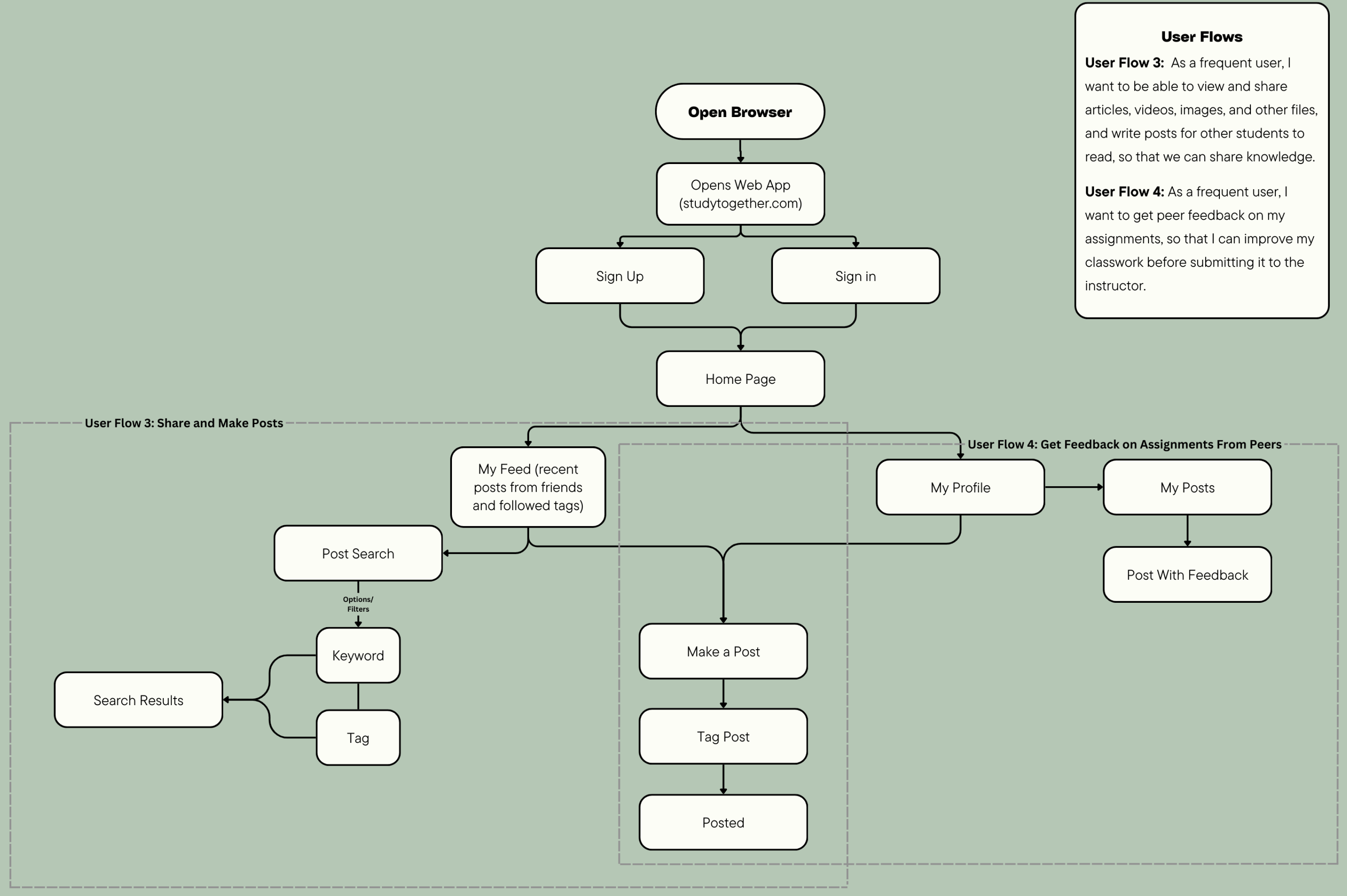
User Flows
I began by developing user flows to ensure that the app’s key functions—uploading study materials, requesting feedback, and connecting with peers—were simple and intuitive. These flows were designed to minimize friction, allowing students to focus on collaboration and learning.
Initial Wireframes
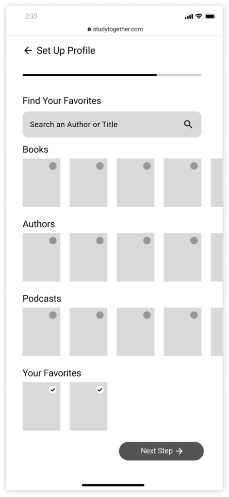
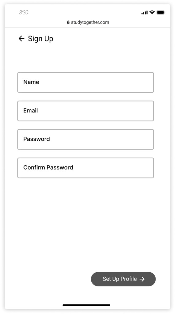
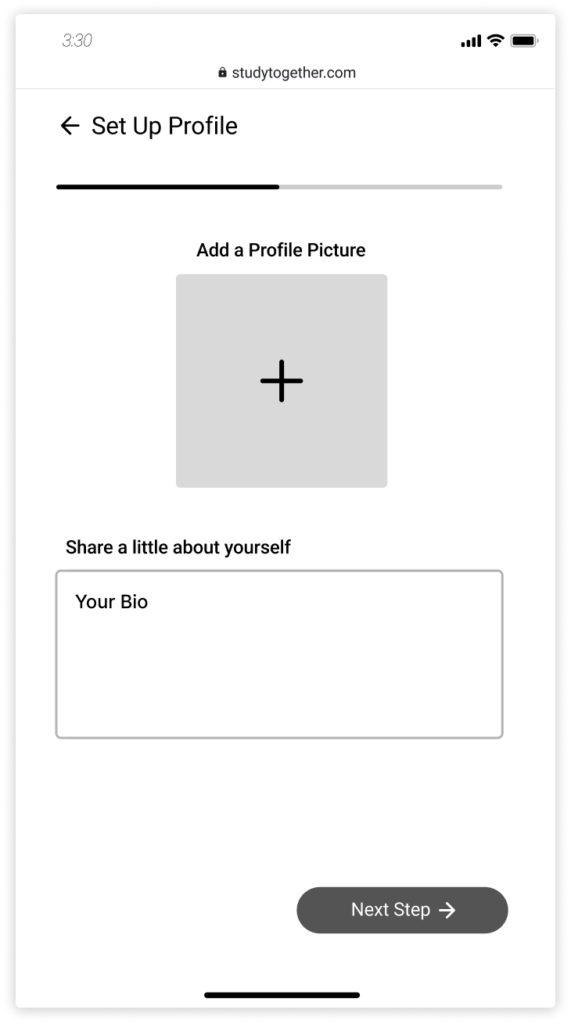
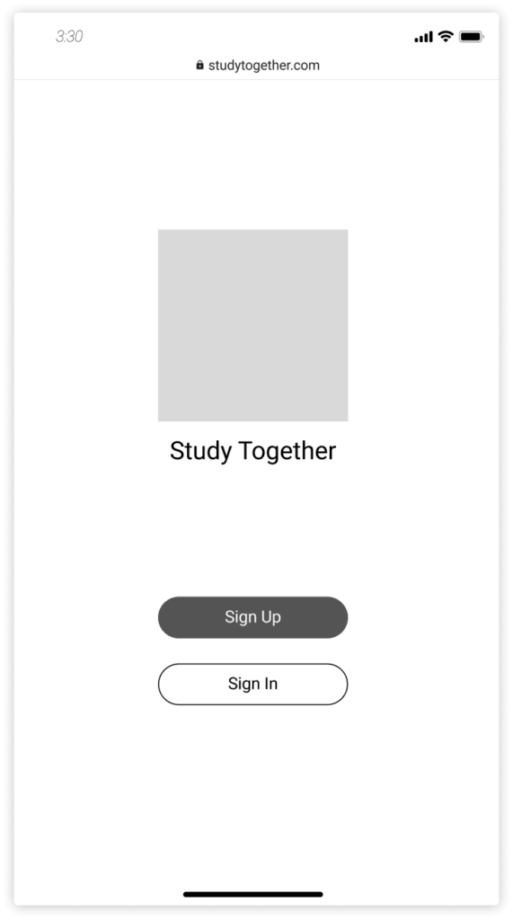
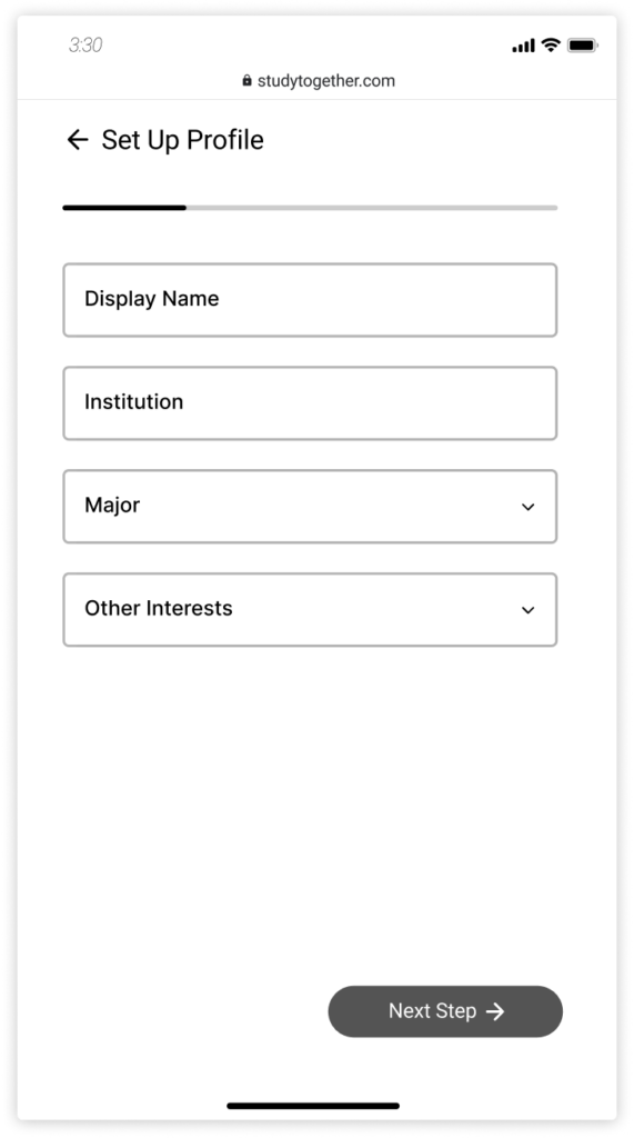
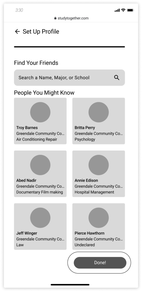
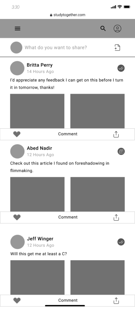
Low-fidelity wireframes were created to visualize the app’s structure and ensure smooth navigation. These wireframes laid the groundwork for the overall layout and functionality, making sure that the core features were easily accessible.
High-Fidelity Wireframes
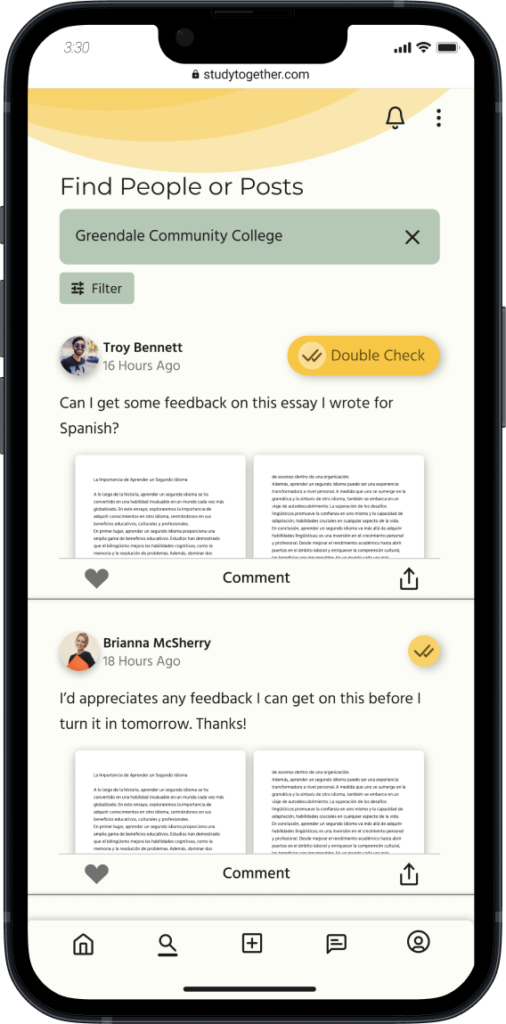
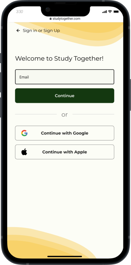
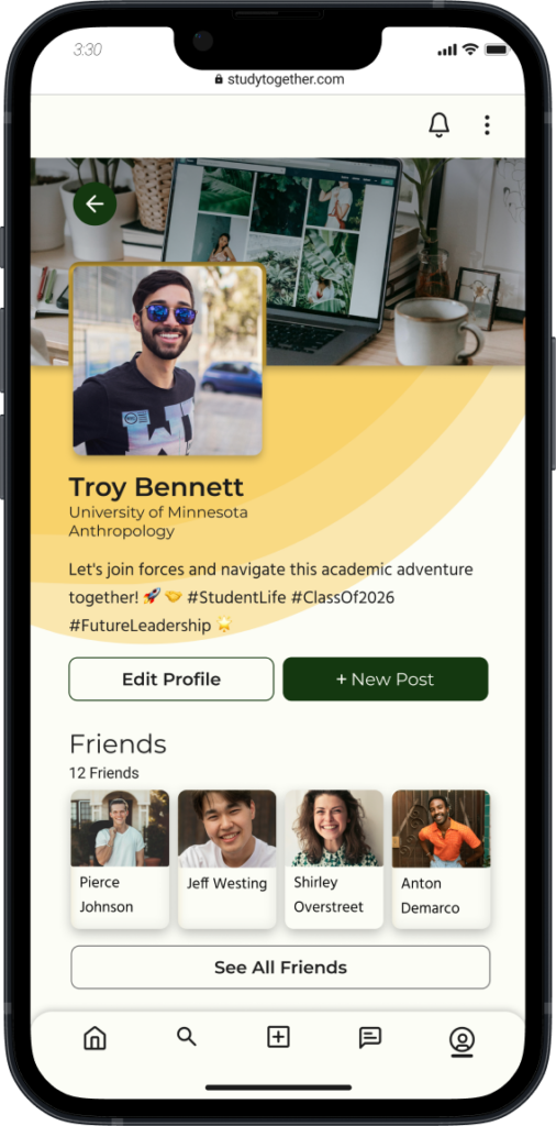
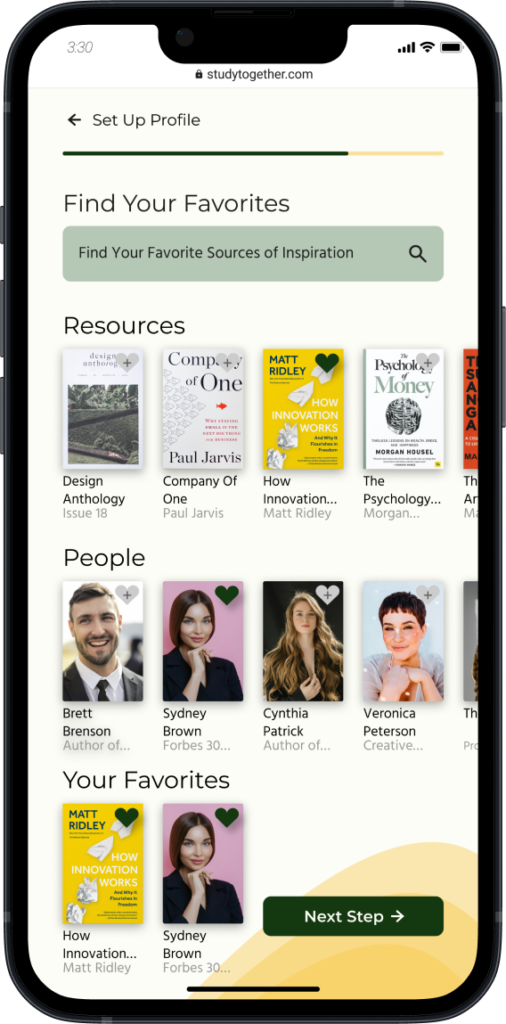
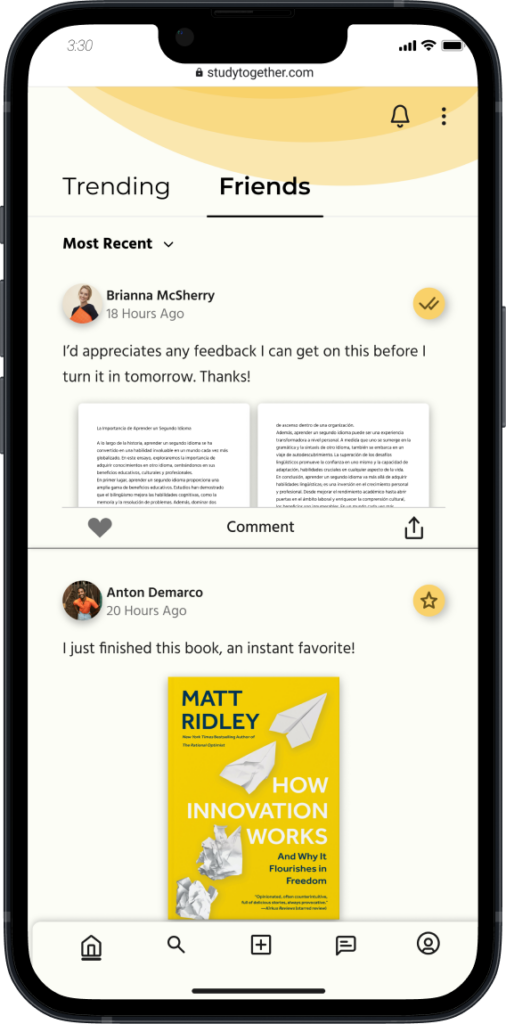
Once the core structure was validated, I moved to high-fidelity wireframes. These focused on refining the visual design, emphasizing simplicity and a welcoming aesthetic. The wireframes highlighted key features like peer-to-peer collaboration and feedback tools while ensuring a smooth, distraction-free user experience.
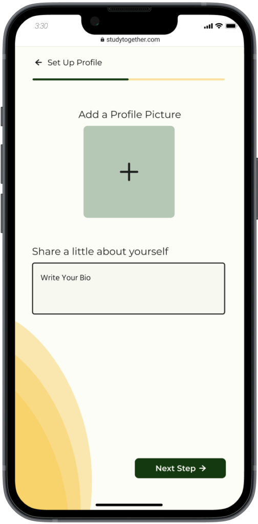
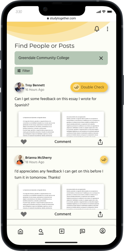
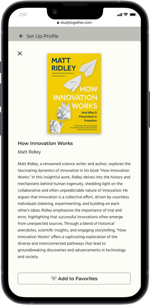
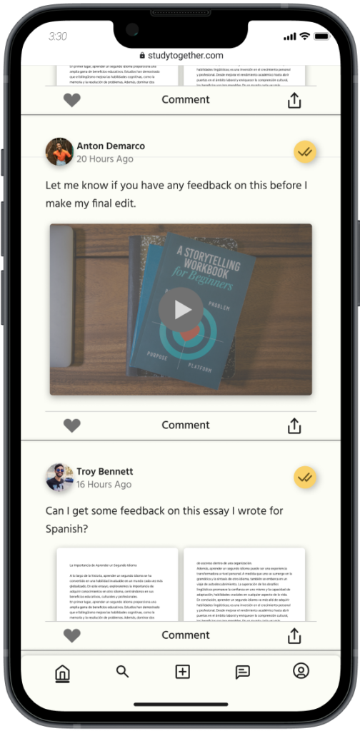
Mobile-First Design and Breakpoints
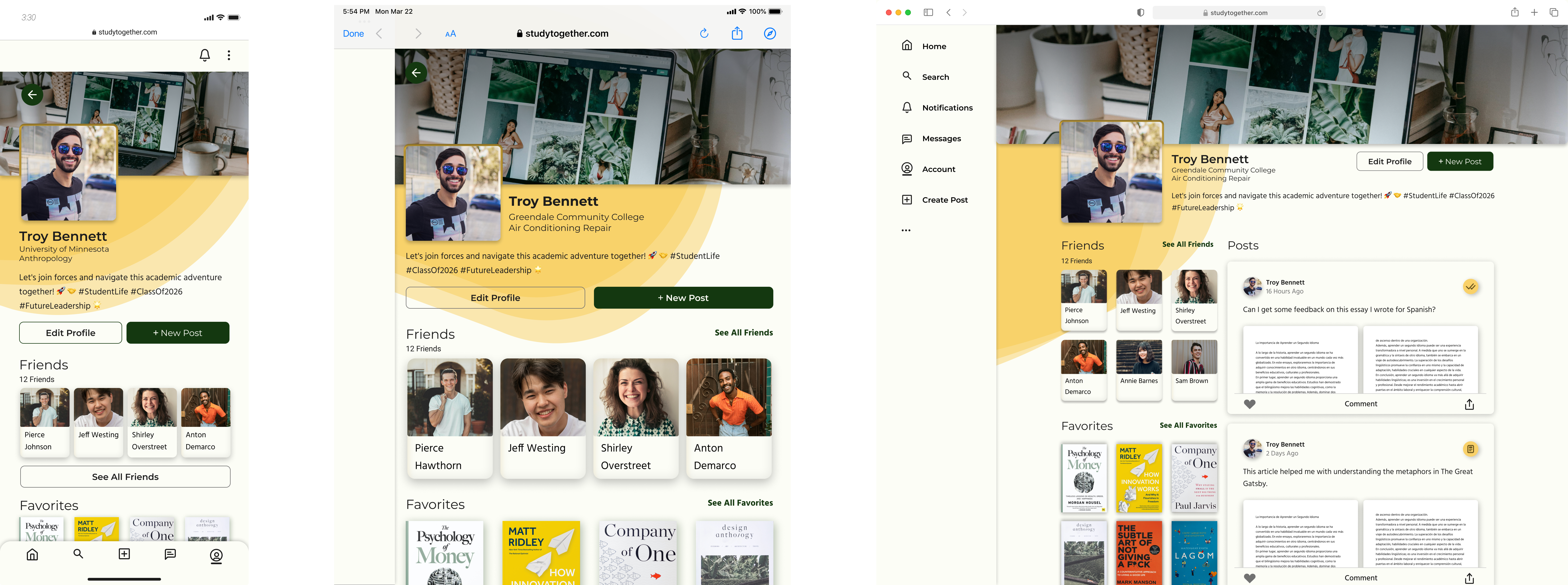
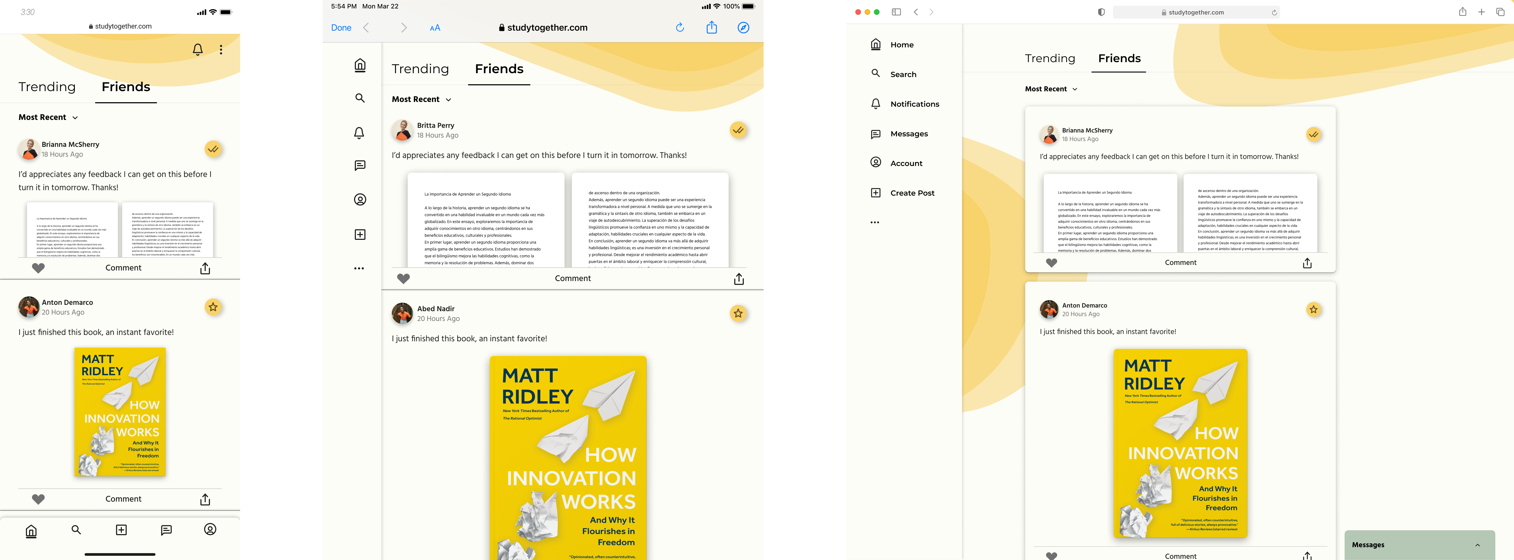
The design process started with a mobile-first approach, ensuring the website delivered a seamless experience on smartphones. Once the mobile designs were completed, I created tablet and desktop breakpoints, adapting the layout to maintain the same intuitive user flow and aesthetic while making the most of larger screen sizes. This responsive approach ensured a consistent and engaging experience across all devices.
The Results
The Study Together app successfully delivers a user-friendly, collaborative platform that connects students, allowing them to share study materials and receive feedback. The design facilitates remote learning, ensuring that students who cannot attend campus or have busy schedules can still engage meaningfully with their peers.
